1
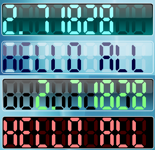
This article describes an approach to
constructing a cool segmented
HMI and
SCADA LED displayer that is similar
to the
SCADA
LEDs used in
alarm clocks and industry
monitors. This control can be used to display
time, numerical values and even some English
characters. I hope it will be helpful in
programs such as hardware simulators.
2
In this section, I would like to give a brief
introduction to the ideas behind this control.
In a 7-segment LED
displayer, one character is composed of at most
7 segments, as in the picture shown below.
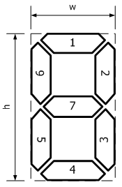
Figure 1: Segmented character
Each segment has the following properties:
the width of the segment, the bevel rate of the
corners in the segment and the interval between
segments.
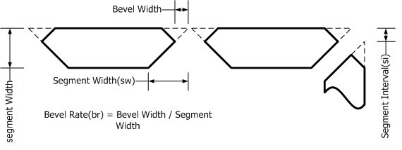
Figure 2: Properties of each segment
If we mark those 7 segments with numbers, as
the picture shows in Figure 1, then we can use
indices to represent different characters. For
example, the character "1" can be represented as
(2, 3) and the character "5" can be represented
as (1, 6, 7, 3, 4). To draw the whole scene, we
should first calculate the bound rectangles
where a certain character is drawn. Then the
segments in each specified bound rectangle
should be drawn. The algorithm for drawing a
7-segmented LED
character in a specified bound rectangle is
shown in Figure 3.
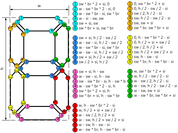
Figure 3: Drawing one character
3
This control
is quite easy to use. Just drag it from the
toolbox to your form in design mode. Then adjust
its provided properties in the designer or at
runtime to modify its appearance. The properties
are listed in the table below:
BorderWidth |
int |
Get or set
the width of the border around the
control. |
BorderColor |
System.Color |
Get or set
the color of the border around the
control. |
HighlightOpaque |
byte |
Get or set
the opaque value of the highlight.
0 implies that the highlight will
end transparent, while 100
implies that the highlight will keep its
transparency from the beginning. |
ShowHighlight |
bool |
Get or set
a value indicating whether to show the
highlight area on the control. If it is
set to false, the value of
the HighlightOpaque
property is ignored. |
CornerRadius |
int |
Get or set
the corner radius for the control. If
RoundCorner equals
false, the value of this property
is ignored. The valid value is from
1 to 10. |
GradientBackground |
bool |
Get or set
a value indicating whether the
background was filled in gradient
colors. |
BackColor_1 |
System.Color |
Get or set
the first background color. If
GradientBackground equals
true, this color will be the
color at the top of the background
rectangle. Otherwise, this color will be
the solid background color. |
BackColor_2 |
System.Color |
Get or set
the second background color. If
GradientBackground equals
true, this color will be the
color at the bottom of the background
rectangle. Otherwise, this color will be
ignored. |
RoundCorner |
bool |
Get or set
the border style. If it is true,
the border of the control will be a
round rectangle. Otherwise, the border
is a normal rectangle. |
SegmentIntervalRatio |
int |
Get or set
the segment-interval ratio. The larger
this value is, the wider the gaps
between segments are. |
TextAlignment |
Alignment |
Get or set
the alignment style of the text. |
SegmentWidthRatio |
int |
Get or set
the segment-width ratio. The larger this
value is, the wider the segments are. |
TotalCharCount |
int |
Get or set
the total number of characters to
display. If the number of characters
contained in the displaying text is
larger than this value, the displaying
character will be truncated. |
BevelRate |
float |
Get or set
the bevel rate of each segment. Please
refer to Figure 2 for further
information. |
FadedColor |
System.Color |
Get or set
the color of faded background
characters. |
Text |
string |
Get or set
the text of the control. |
4
A hmi and
Scada control
at presentation level may do lots of
painting. Most of the time, the control has to
be repainted when one of its properties is
changed. This may cause multiple invalidating if
several properties of the control are changed in
quick succession. In order to avoid multiple
painting, we can implement the
ISupportInitialize interface in our
control. First, we set a member variable in the
BeginInit() method.
 Collapse
 |
Copy
Code
private bool m_bIsInitializing = false;
void ISupportInitialize.BeginInit()
{
    m_bIsInitializing = true;
}
Then we rewrite our properties in the
following manner:
Collapse |
Copy
Code
public Color FadedColor
{
get
{
return m_colFadedColor;
}
set
{
if (m_colFadedColor == value)
return;
m_colFadedColor = value;
if (!m_bIsInitializing)
{
Invalidate();
}
}
}
At last, in the EndInit()
method, we turn off the initialization mode and
repaint the control.
Collapse |
Copy
Code
void ISupportInitialize.EndInit()
{
    m_bIsInitializing = false;
    Invalidate();
}
Now we can use batch initialization to
prevent successive painting of the
control.
Collapse |
Copy
Code
((System.ComponentModel.ISupportInitialize)mycontrol).BeginInit();
mycontrol.BackColor = System.Drawing.Color.Transparent;
mycontrol.BackColor_1 = System.Drawing.Color.Black;
mycontrol.BackColor_2 = System.Drawing.Color.Transparent;
mycontrol.BevelRate = 0.5F;
mycontrol.BorderColor = System.Drawing.Color.White;
mycontrol.FadedColor = System.Drawing.Color.Black;
((System.ComponentModel.ISupportInitialize)mycontrol).EndInit();


 E-XD++Visual
C++/ MFC Products
E-XD++Visual
C++/ MFC Products
 Next-->